
Goo Goo Cluster
___
Goo Goo Cluster
___
Goo Goo Cluster
___
Goo Goo Cluster
___
Goo Goo Cluster
___
The Standard Candy Company was established in 1901 in Nashville, Tennessee and in 1912, they crafted the first ever combination candy bar, the Goo Goo Cluster. The confection was a milk chocolate candy filled with caramel, marshmallow, and peanuts. Previous to the advent of the Goo Goo Cluster, candy bar manufacturing consisted of bars of only chocolate, only caramel or taffy. The Goo Goo Cluster represented the first time a bar consisted of more than just one principal ingredient. Despite the candy having always been made in Nashville, Tennessee, the brand continued to grow and evolve for close to a century. The process of manufacturing the beloved candy also expanded and changed. The emphasis on the tradition and quality ingredients became diluted. Goo Goo Cluster was the initial brand for Standard Candy, however, in 1999 a subsidiary, Standard Function Foods, was established and gradually the emphasis moved away from branded products such as these tasty treats. As the shift in concentration for Standard Candy continued to grow, little attention was paid to the Goo Goo Cluster brand.
The Standard Candy Company was established in 1901 in Nashville, Tennessee and in 1912, they crafted the first ever combination candy bar, the Goo Goo Cluster. The confection was a milk chocolate candy filled with caramel, marshmallow, and peanuts. Previous to the advent of the Goo Goo Cluster, candy bar manufacturing consisted of bars of only chocolate, only caramel or taffy. The Goo Goo Cluster represented the first time a bar consisted of more than just one principal ingredient. Despite the candy having always been made in Nashville, Tennessee, the brand continued to grow and evolve for close to a century. The process of manufacturing the beloved candy also expanded and changed. The emphasis on the tradition and quality ingredients became diluted. Goo Goo Cluster was the initial brand for Standard Candy, however, in 1999 a subsidiary, Standard Function Foods, was established and gradually the emphasis moved away from branded products such as these tasty treats. As the shift in concentration for Standard Candy continued to grow, little attention was paid to the Goo Goo Cluster brand.


SERVICES
Logo Design
Packaging Design
Website Design
Stationery Design
POP Display Design
Environmental & Signage Design
Outdoor & Print Advertising
Brand Standards
Guidelines Manual
SERVICES
Logo Design
Packaging Design
Website Design
Stationery Design
POP Display Design
Environmental & Signage Design
Outdoor & Print Advertising
Brand Standards
Guidelines Manual
SERVICES
Strategic Brand Messaging
Strategic Brand Positioning
Traditional Public & Media Relations
Community Relations
Partnership Development
Special Event Development
Communications Collateral
Apparel Design
Website Design
SERVICES
Local Media Outreach across 4 DMA’s
Regional Media Outreach across 4 DMA’s
National Media Outreach
Influencer Engagement
On-Site Events
Off-Site Events
Partnerships
Media Training
PROCESS
The focus for Goo Goo Cluster in most recent years had been on production for the product. Standard was selling the product at a discounted price point, forgetting the cost that it took to make the product. The costs associated with producing the clusters had not left much room for profit margins in a retail arena focused on low-cost treats. With sales peaking in the early 1980s and a move away from branded products in the 1990s, the brand had been left behind.
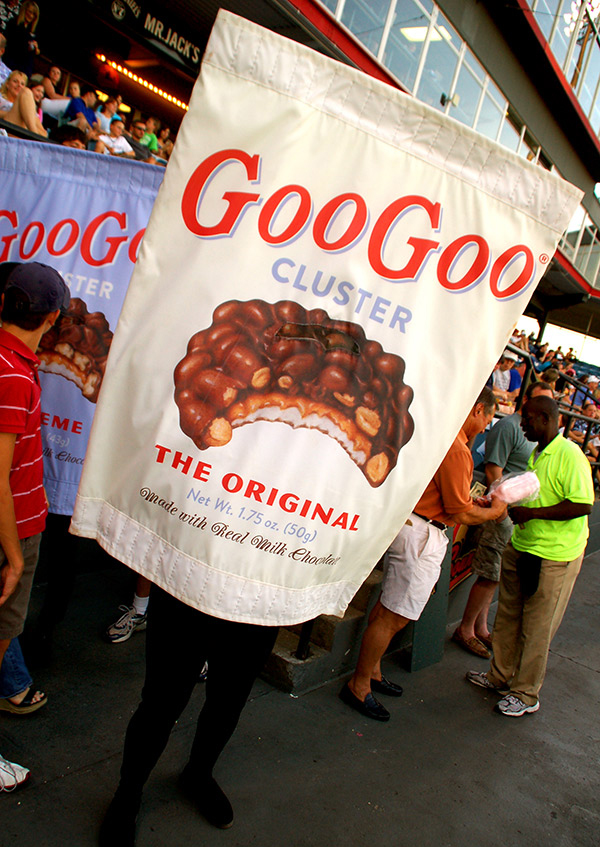
With new thinking about position within the market place, Goo Goo Cluster’s brand and packaging did not support its brand goals or attributes. With the brand’s 100th anniversary approaching in 2012, it needed to be revitalized and refocused on the Southern roots and rich history of the high-quality product. The premium chocolate product was still manufactured in Nashville, TN and had a rich history in the Southern U.S., even having affiliations with the Grand Ole Opry. Green Olive was charged with rebuilding the image of the brand, giving life back to the world’s first ever combination candy bar. Consumers needed to be reminded of the high quality product and the heritage behind the brand.
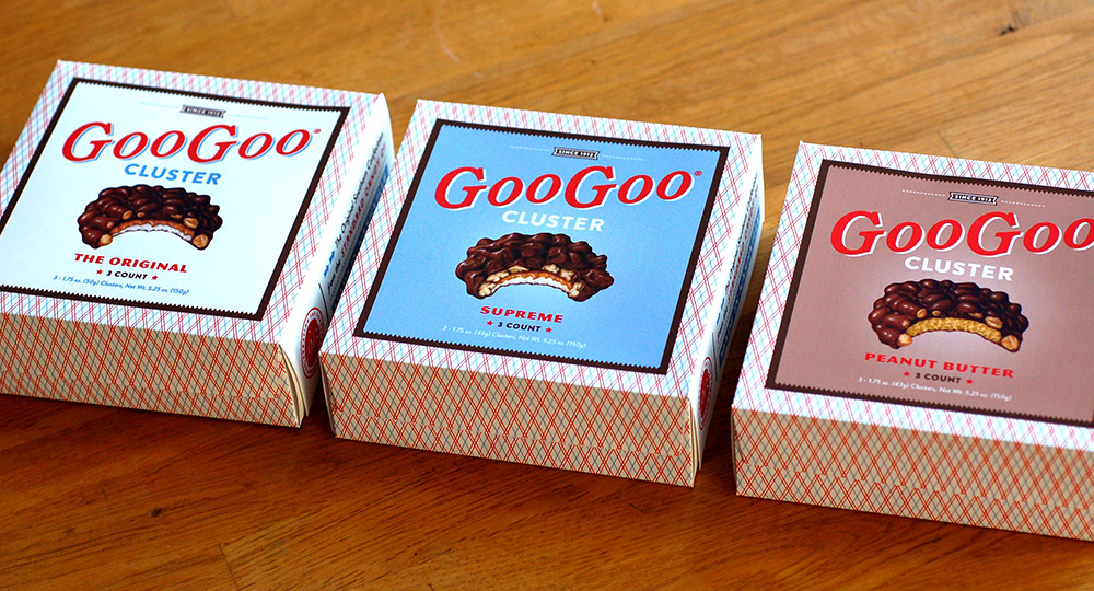
Standard Candy upgraded the ingredients, including a more premium chocolate without partially hydrogenated oils and vanillin, so it was imperative for the design to reflect those quality improvements. The design, which reflects the modern approach to manufacturing and ingredients but the classic and timeless heritage of the brand, was developed through extensive research of the brand’s history and analysis of the current brand positioning. The design is not a retro or old-timey concept, but an homage to the brand’s rich history which reflects a classic, high quality product. A new identity with two logo variations utilizes enough of the attributes of the old logo to maintain existing brand equity while adding a fresh perspective.
The focus for Goo Goo Cluster in most recent years had been on production for the product. Standard was selling the product at a discounted price point, forgetting the cost that it took to make the product. The costs associated with producing the clusters had not left much room for profit margins in a retail arena focused on low-cost treats. With sales peaking in the early 1980s and a move away from branded products in the 1990s, the brand had been left behind.
With new thinking about position within the market place, Goo Goo Cluster’s brand and packaging did not support its brand goals or attributes. With the brand’s 100th anniversary approaching in 2012, it needed to be revitalized and refocused on the Southern roots and rich history of the high-quality product. The premium chocolate product was still manufactured in Nashville, TN and had a rich history in the Southern U.S., even having affiliations with the Grand Ole Opry. Green Olive was charged with rebuilding the image of the brand, giving life back to the world’s first ever combination candy bar. Consumers needed to be reminded of the high quality product and the heritage behind the brand.
Standard Candy upgraded the ingredients, including a more premium chocolate without partially hydrogenated oils and vanillin, so it was imperative for the design to reflect those quality improvements. The design, which reflects the modern approach to manufacturing and ingredients but the classic and timeless heritage of the brand, was developed through extensive research of the brand’s history and analysis of the current brand positioning. The design is not a retro or old-timey concept, but an homage to the brand’s rich history which reflects a classic, high quality product. A new identity with two logo variations utilizes enough of the attributes of the old logo to maintain existing brand equity while adding a fresh perspective.
RESULTS
Goo Goo Cluster has returned to the hearts and minds of its hometown consumers in Nashville, as well as candy enthusiasts across the nation. The work created for Goo Goo Cluster gave the premium product a higher perceived value to the consumer as well as a more unified presence in the marketplace. The brand guidelines established for the brand help to maintain that cohesiveness. Goo Goo Cluster has been re-introduced into the mainstream by expansion into Southern supermarkets and drug store chains and was recently named a Garden & Gun Readers’ Favorite Classic Southern Brand. Internet sales for Goo Goo Clusters have increased exponentially, exceeding expectations.
Our work for Goo Goo Cluster has been recognized in the form of an American Graphic Design Award, Neenah Paperworks Silver Award, AIGA Seed Award, and American Package Design Award.


Selected Works

The Ritz-CarltonDesign, Public Relations, Social Media | St. Louis, MO

Virgin HotelsDesign | International Brand
Live! by LoewsDesign | Arlington, TX

Loews Coronado Bay ResortDesign | Coronado, CA

Loews Coral Gables HotelDesign | Coral Gables, FL

The CassoDesign | Raleigh, NC
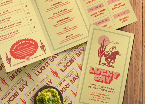
Lucky DayDesign | Covington, GA

The GarrisonDesign | Ozark, MO

Tysons RickhouseDesign | Tysons Corner, VA

The MemphianDesign | Memphis, TN

Loews Kansas City HotelDesign | Kansas City, MO

The Lodge at SonomaDesign | Sonoma, CA

Barbary Beach HouseDesign | Key West, FL

Havana Cabana HotelDesign | Key West, FL

Cotton House HotelDesign & Public Relations | Cleveland, MS

The Pool ClubDesign | Dallas, TX

Rib Country BBQDesign | Georgia & North Carolina

Sweetwater Brewing CompanyPublic Relations | Atlanta, GA

Heaton'sDesign | Kimpton Hotel - Vero Beach, FL

Loews HotelsDesign | International Brand

Sotherly HotelsDesign | National Brand

Marriott HotelsDesign | International Brand

Westin HotelsDesign | International Brand

The Ritz-CarltonDesign | International Brand

Stray HorseDesign | Houston, TX

All WaterDesign | Seattle, WA

Shorebreak ResortDesign | Huntington Beach, CA

The HubDesign | Watersound Beach, FL

C. Ellet'sDesign | Atlanta, GA

City PharmacyDesign | Covington, GA

Fox Bros. Bar-B-QPublic Relations & Design | Atlanta, GA

Sugarfire Smoke HousePublic Relations | Multiple Locations Across the Midwest

Chicken + BeerPublic Relations & Design | Atlanta, GA

Southern NationalPublic Relations & Design | Mobile, AL

Taqueria del SolPublic Relations | Atlanta, GA

SmithfieldPublic Relations | Smithfield, VA

Chef Tim ByresPublic Relations | Dallas, TX

Precinct Kitchen + BarDesign | Boston, MA

Pie ProvisionsDesign | Woodstock, GA

SalataPublic Relations | National Brand

ScoutDesign | Atlanta, GA

Holler & DashPublic Relations

SupericaDesign | Atlanta, GA

The El FelixDesign | Alpharetta, GA

Olive & SinclairPublic Relations & Design | Nashville, TN

The AshburnDesign | Chicago, IL

Fish BarDesign | New York, NY

Goo Goo ClusterPublic Relations & Design | Nashville, TN

Rowe BarDesign | St. Pete Beach, FL

St. Johns Provision Co.Design | Jacksonville, FL

Richards' Southern FriedDesign | Atlanta, GA

Community SmithPublic Relations & Design | Atlanta, GA

Village LawnDesign | Gulf Shores, AL

CanoePublic Relations & Design | Atlanta, GA

Bank & BourbonPublic Relations & Design | Philadelphia, PA

Mason'sPublic Relations & Design | Nashville, TN

Georgian TerracePublic Relations & Design | Atlanta, GA

Total Beverage SolutionPublic Relations & Design | National Campaign
© Green Olive Media
© Green Olive Media
© Green Olive Media
© Green Olive Media
© Green Olive Media