
The Hub
Watersound Beach, FL
___
The Hub
Watersound Beach, FL
___
The Hub
Watersound Beach, FL
___
The Hub
Watersound Beach, FL
___
The Hub
Watersound Beach, FL
___
Green Olive Media provides creative thought leadership & branding for restaurants, hotels, and mixed-use developments. Our team both concepts and executes the design process for new and repositioned hospitality spaces. This process includes consulting on everything from interior and exterior design of retail and restaurant common areas, logo design, signage opportunities, and all manner of supporting brand collateral. When The Hub came to Green Olive, they needed a creative hand to help hone in on their vision for a mixed-use development along the beautiful stretch of Florida highway known as 30A. The development features a large green with a central amphitheater as the focal point, surrounded by retailers and restaurants.
With this blueprint as a jumping off point, The Hub’s goal was to bring back nostalgic summers spent outside with the whole family. Green Olive dove into the rich beach culture of Florida, as well as the nostalgia of the essential summer road trip. After finding inspiration from vintage roadside signage, the branding evolved into the perfect marriage of old and new. By bringing elements of the past into the present, The Hub’s branding creates a unique experience for guests both old and young. Green Olive designed a cohesive brand system for all of the food & beverage outlets under The Hub umbrella, ensuring that the aesthetics were harmonious, while maintaining a distinct individual identity for each concept.


Red's Chicken Shack
___
Red's Chicken Shack
___
Red's Chicken Shack
___
Red's Chicken Shack
___
Red's Chicken Shack
___
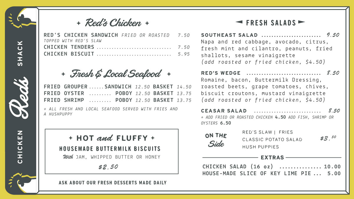
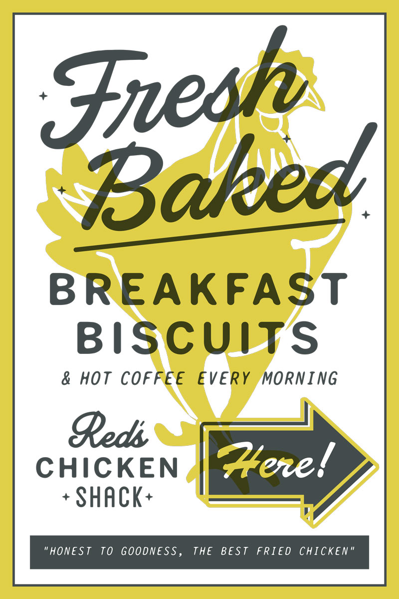
The Hub wanted there to be no doubt that their fried chicken is indeed the best in the area. They wanted to build the credibility of their new fried chicken “shack” by having Green Olive create a branding system that is reminiscent of the past—they wanted their diners to feel that Red’s has been around for decades.
Inspired by specifically 1950’s roadside signage, food packaging and restaurant signs, Green Olive set out to create a brand for the chicken shack that would reflect all the nostalgia that encompasses fried chicken. They wanted the brand to look like it could belong in the past—yet thrive in modern times.


Mile Marker 15
___
Mile Marker 15
___
Mile Marker 15
___
Mile Marker 15
___
Mile Marker 15
___
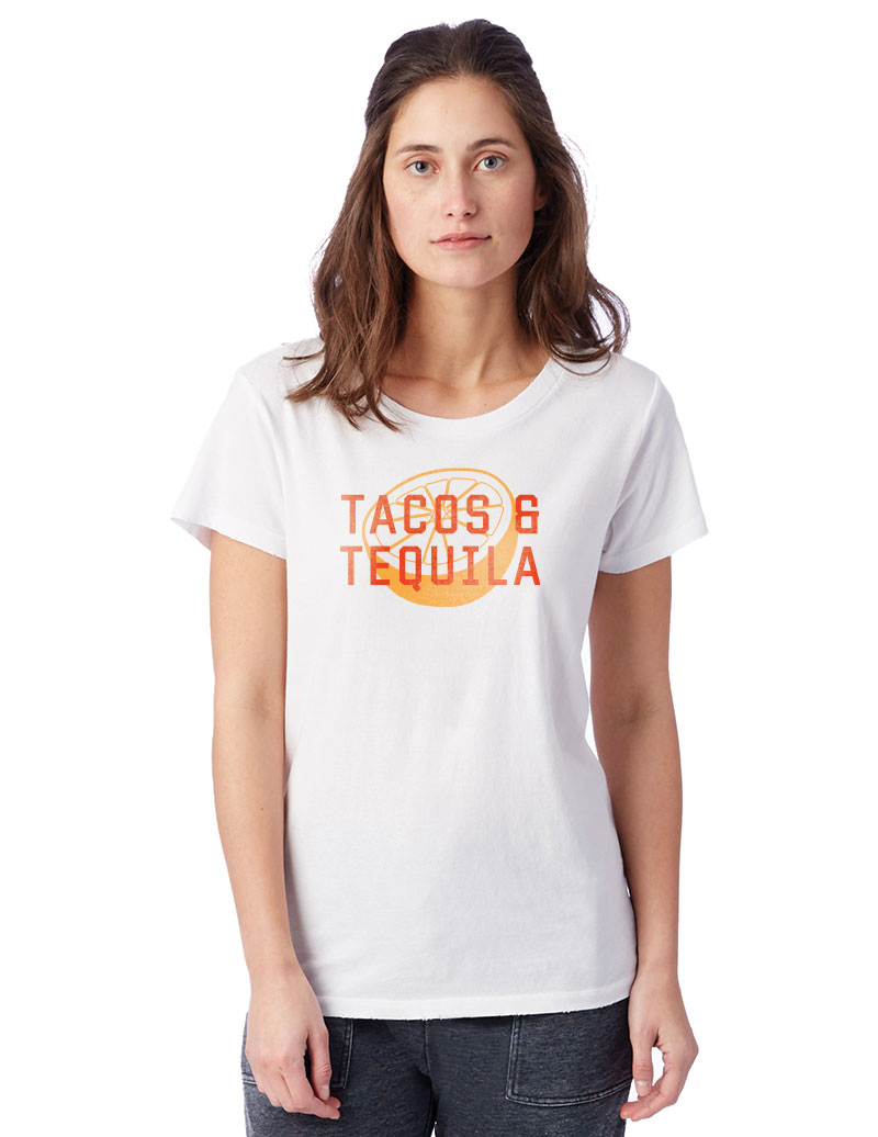
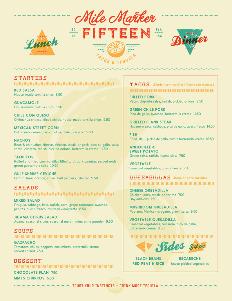
The Hub wanted Mile Marker 15 to be a place where the tacos are killer and the drinks are cold. To match that idea, the branding of Mile Marker 15 would need to be bold, inviting, and lively, projecting a place where there’s something for everyone, kids and adults alike.
Inspired by the sign paintings found on old Mexican buildings, MM15’s branding is bright, bold, and memorable. Green Olive Media made sure the branding reflected the fresh food and drink that the restaurant would be known for by creating a branding system that felt bold and current.

Crave Roadside Burgers
___
Crave Roadside Burgers
___
Crave Roadside Burgers
___
Crave Roadside Burgers
___
Crave Roadside Burgers
___
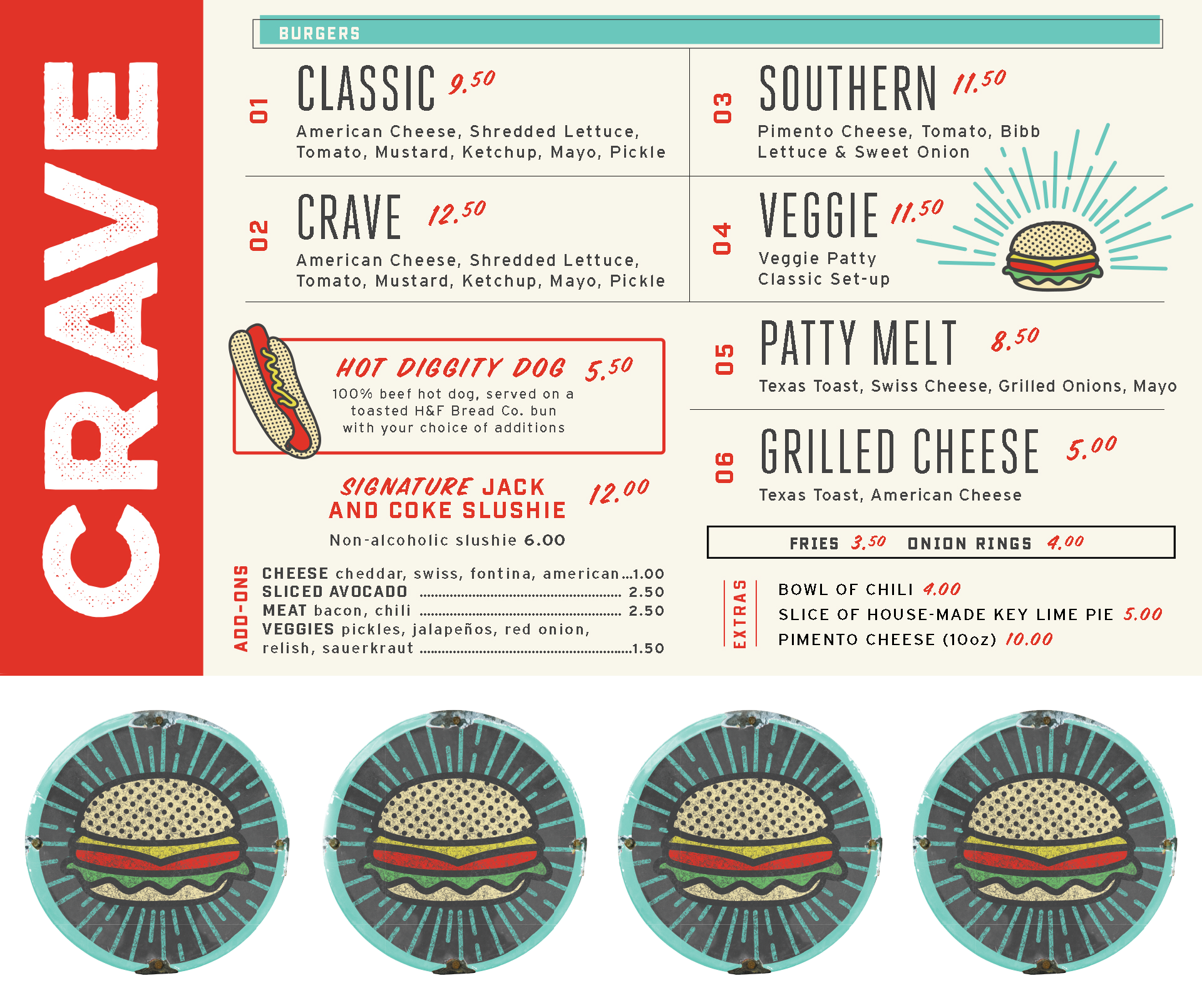
The Hub wanted their hamburger restaurant to have a strong sense of nostalgia—they wanted people to resonate with Crave Burger based on their own memories of eating hamburgers at the beach. The restaurant features freshly grilled burgers, hand cut french fries and whiskey coke slushies.
Inspired by both old-style and modern burger establishments, this branding system combines sleek letterforms and clean lines with a retro flair. The style of the branding reflects the modernity of the concept as well as a sense of nostalgia and with illustrative touches.


Selected Works

The Ritz-CarltonDesign, Public Relations, Social Media | St. Louis, MO

Virgin HotelsDesign | International Brand
Live! by LoewsDesign | Arlington, TX

Loews Coronado Bay ResortDesign | Coronado, CA

Loews Coral Gables HotelDesign | Coral Gables, FL

The CassoDesign | Raleigh, NC
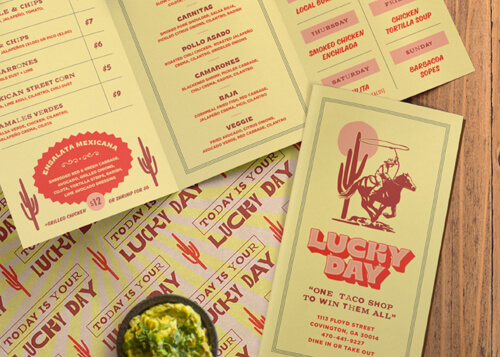
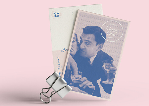
Lucky DayDesign | Covington, GA

The GarrisonDesign | Ozark, MO

Tysons RickhouseDesign | Tysons Corner, VA

The MemphianDesign | Memphis, TN

Loews Kansas City HotelDesign | Kansas City, MO

The Lodge at SonomaDesign | Sonoma, CA

Barbary Beach HouseDesign | Key West, FL

Havana Cabana HotelDesign | Key West, FL

Cotton House HotelDesign & Public Relations | Cleveland, MS

The Pool ClubDesign | Dallas, TX

Rib Country BBQDesign | Georgia & North Carolina

Sweetwater Brewing CompanyPublic Relations | Atlanta, GA

Heaton'sDesign | Kimpton Hotel - Vero Beach, FL

Loews HotelsDesign | International Brand

Sotherly HotelsDesign | National Brand

Marriott HotelsDesign | International Brand

Westin HotelsDesign | International Brand

The Ritz-CarltonDesign | International Brand

Stray HorseDesign | Houston, TX

All WaterDesign | Seattle, WA

Shorebreak ResortDesign | Huntington Beach, CA

The HubDesign | Watersound Beach, FL

C. Ellet'sDesign | Atlanta, GA

City PharmacyDesign | Covington, GA

Fox Bros. Bar-B-QPublic Relations & Design | Atlanta, GA

Sugarfire Smoke HousePublic Relations | Multiple Locations Across the Midwest

Chicken + BeerPublic Relations & Design | Atlanta, GA

Southern NationalPublic Relations & Design | Mobile, AL

Taqueria del SolPublic Relations | Atlanta, GA

SmithfieldPublic Relations | Smithfield, VA

Chef Tim ByresPublic Relations | Dallas, TX

Precinct Kitchen + BarDesign | Boston, MA

Pie ProvisionsDesign | Woodstock, GA

SalataPublic Relations | National Brand

ScoutDesign | Atlanta, GA

Holler & DashPublic Relations

SupericaDesign | Atlanta, GA

The El FelixDesign | Alpharetta, GA

Olive & SinclairPublic Relations & Design | Nashville, TN

The AshburnDesign | Chicago, IL

Fish BarDesign | New York, NY

Goo Goo ClusterPublic Relations & Design | Nashville, TN

Rowe BarDesign | St. Pete Beach, FL

St. Johns Provision Co.Design | Jacksonville, FL

Richards' Southern FriedDesign | Atlanta, GA

Community SmithPublic Relations & Design | Atlanta, GA

Village LawnDesign | Gulf Shores, AL

CanoePublic Relations & Design | Atlanta, GA

Bank & BourbonPublic Relations & Design | Philadelphia, PA

Mason'sPublic Relations & Design | Nashville, TN

Georgian TerracePublic Relations & Design | Atlanta, GA

Total Beverage SolutionPublic Relations & Design | National Campaign
© Green Olive Media
© Green Olive Media
© Green Olive Media
© Green Olive Media
© Green Olive Media